Do you know what makes your web page readable? Here’s a thought from curator, educator, and critic Ellen Lupton, from her book Thinking with type.
The impatience of the digital reader arises from culture, not from the essential character of display technologies. Users of websites have different expectations of print. They expect to feel “productive,” not contemplative. They expect to be in search mode, not processing mode.
Ellen Lupton, Thinking with type: A critical guide for designers, writers, editors, and students (2010)
In other words, readable pages are scannable. And that means using fonts that are easy to read.
Here is a guide to best practices with fonts on websites and some tips for finding great fonts.
Check your website’s defaults
The website templates we work with are sometimes too artistic for our own good. The first thing you must do is check these defaults.
Font-size
Body text that you want people to read—like your paragraphs—should be at least 16 pixels…but 17 pixels is even better.
Fine print, like the copyright in your footer, the link to your privacy page, and photo credits should be a smaller size.
Font-color
Some years ago, it was deemed that stark black text on a white screen was too much contrast and would cause eye-strain. So web designers started giving us grey text. What looks good to web designers, on their big monitors in their brightly-lit offices, can be hard to read in our own dim rooms, or outside, not to mention on our tablets and phones.
If the text on your website is too faint, the reader may give up and go elsewhere. Lower the text color to #333333 or even “pure” black (#000000). It’s impossible to actually render pure black on our devices, so don’t worry about going that dark. Then test it by viewing your website in different spaces and on different devices.
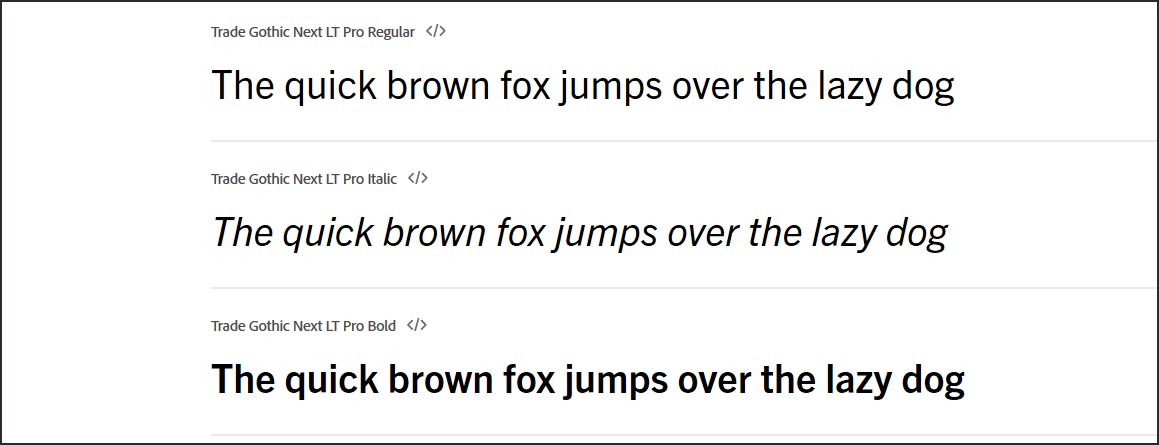
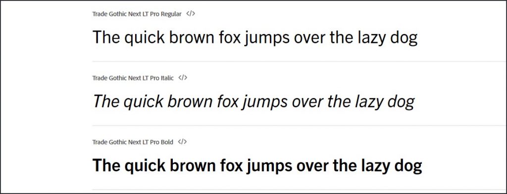
Choosing font styles
The first rule is to limit the number of fonts on your site. Up to three is fine. Any more than that is chaotic and draws attention to itself. And that gets in the way of your message.
The standard for easy reading of web pages is a sans serif font for your paragraphs and any other text that will be read in detail.
Serif or sans serif fonts can be used for headings.
You could use a third font to support your branding, such as labels.
Font styles such as script, handwriting, or artistic designs usually work best if they are used for short bits of text. Long words and long phrases in a complex font can be tedious to read and may be skipped over. The same goes for “all caps”.
In 1996 Microsoft released two fonts designed specifically for the web: Verdana (sans-serif) and Georgia (serif). These could be your starting points if you want to put something up quickly.
Sources of fonts
If you want more choices than what’s offered with your website’s template, and you have some confidence in your technical abilities, check out these resources:
- fonts.google.com has hundreds of free fonts.
- If you have an Adobe Creative Cloud plan, you have free access to thousands of Adobe fonts.
If you are going to use a font from one of these sources, make sure you embed the font in your website so that it is automatically loaded with your page. The website from which you get the font will have the embedding instructions in the FAQ.
What is that font?
Did you see a font you like on a web page and you want to know what it is? Your browser can help you find out what it’s called.
Here’s how.
Websites that get used
No one should spend too much time searching for the perfect font. That can be a real time-waster. Really, priority should be given to writing clear, compelling content with easy-to-read language.
That said, your content won’t even be read if it’s a strain on the eyes of your impatient, searching readers who only want to scan what’s in front of them.
I hope you find these tips useful for making your font decisions quickly so that you can get your website looking its best and working for you fast.
Would you like a printable one-sheet summary of these tips? Here it is.